Through the Looker Glass – Part 1: 5 Steps to Creating Beautiful Looker Dashboards
With more data at their disposal every day, businesses have the opportunity to draw impactful insights about the market, consumers, and services and make critical business decisions each day. However, making sense of massive amounts of data is not always straightforward.
A clear visual representation of information unlocks:
- Rapid problem solving via faster access to business insights
- Relationships and patterns
- Emerging trends
- Seamless communication between parties
- A clear understanding of operational and business activities
- Direct interaction with data (Improving Understanding with Data Visualizations, AI Multiple Research, 2022).
So, what are some dashboarding best practices to level up your business?
Our “Through the Looker Glass” blog series will demonstrate neat tips and tricks for elevating your Looker dashboards. In this first part, we walk you through 5 steps to transform tired and ineffective dashboards, drawing on our experience with industry-leading clients transforming data into Looker dashboards to help them achieve their business goals.
Original Dashboard
The dashboard below shows real-time information on revenue, sales, and stock data for a medium-sized grocery store. The dashboard is currently very ineffective and users have reported that they don’t understand how to use it. In order to address these pain points, we need to identify features and aspects that require improvement:
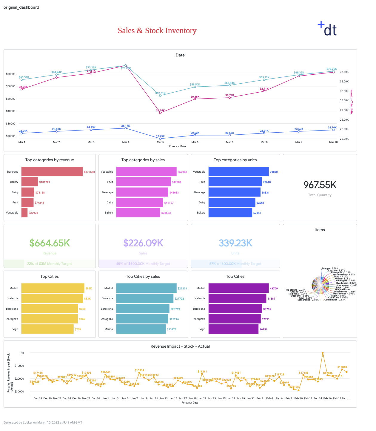
❌ The target audience and purpose of the dashboard is unclear
❌ Axes on the time series’ and other labels are inconsistent
❌ One of the axes does not start from 0
❌ Incorrect data labels are shown on the time series
❌ There is too much information on the page: too many data labels, charts, and lines in one chart
❌ Colour is not used effectively
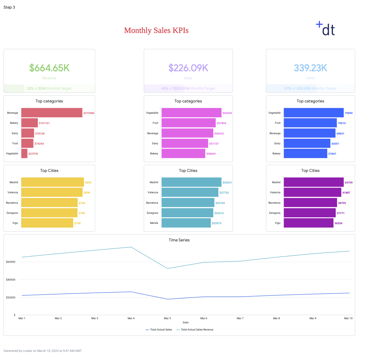
Step 1: Set the Purpose
Focus the dashboard on a target user type (e.g. a certain job role) by asking:
- ‘How technical is the end-user?’
- ‘What do they need to know?’
- ‘How detailed should the information be?’
- ‘What decisions do they need to make?’
- ‘How will the dashboard be viewed? On a tablet? Small screen?’
After answering these questions we can decide on a target audience, without cramming everything into one page.
✅ Set the focus of the dashboard
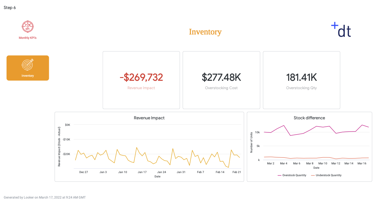
✅ Move irrelevant charts (inventory) to a more suitable dashboard as a one-size-fits-all approach will discourage adoption
✅ Remove irrelevant data (our exec did not want the total number of units or the time series of units held) and show only key metrics
✅ Remove excessive data labels
✅ Utilise user attributes to show user-specific data
✅ Use dynamic dimensions & measures with templated filters or parameters so people don’t have to ‘explore from here’ to find more details.
✅ We generally advise against the use of Pie Charts. They are poor at communicating comparisons as the brain is not very good at comparing angle sizes. They also take up a lot of unusable space.

Step 2: Design the Dashboard Layout
The hierarchy of information is a design principle that states that information should be arranged in order of importance.
Adherence to this principle helps you tell a good data story, and keep the user invested in your dashboard. To do this you should figure out the narrative and create a flow- start with the bigger picture and then provide more detailed information.
✅ Move high-level KPIs to the top. Put the most urgent information in the top left
✅ Group charts by theme or type
✅ Place detailed time series and drill-downs further down the page
✅ Use a maximum of 15 tiles per dashboard for performance and ease of use
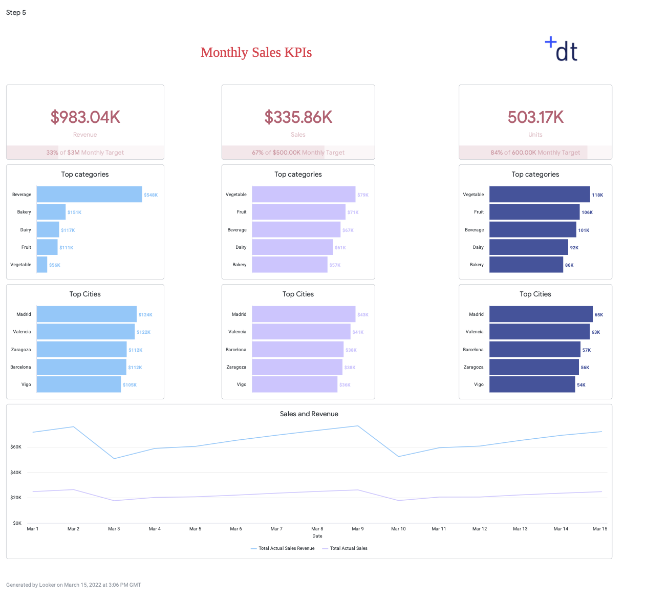
Step 3: Use Colour Like a Pro
Dashboards with too many colours are distracting from the message you are trying to land and can lead to misinterpretation of the data.
You can use colour to encode information, highlight important KPIs/ categories, and direct the users’ attention.
Test the discernibility of closely related colours on different screens/mediums (and red/green for the visually impaired).
✅ Use conditional colour formatting. High-level KPIs remain red until the benchmark is reached
✅ Have different colours for sales, revenue, and units
✅ Use the colour key consistently in all charts
Step 4: Format the Numbers
A quick way to drive adoption for dashboards by making them clear and concise is to use consistent number formatting.
✅ Round high-level figures
✅ Declare the units

Step 5: Use Simple Navigation
Since we separated out the inventory charts in Step 1 into a separate dashboard, we need some way of navigating easily between them.
✅ Create a navigation bar using HTML in a text tile
✅ Create a separate tile for each dashboard
✅ You could also use drills. Have a top-level dashboard that drills into a detailed dashboard using liquid parameters
✅ Select the right charts- use a stacked bar instead of multiple line graphs to see the breakdown
+1 Bonus Step: Provide Context
It is not always obvious to new users how to use a set of dashboards or reports.
✅ Create a page explaining how to use the dashboards

Summary
As a general rule of thumb, every element of the dashboard should in some way be aiding the user experience. Our top tip: If it isn’t helpful, don’t include it. By keeping the user at the forefront of the design, you will be able to transform our dashboard into a targeted data hub for different user types.
We have taken our Looker dashboard from this…..
To this…


Do you want to create powerful dashboards for your business users or take your BI capability to the next level? Have a look at how we created a sophisticated alerting system for leading online retailer, MandM Direct, or contact us.