Through the Looker Glass – Part 2: Creating User-Friendly Looker Dashboards with Information Modals

Looker is a great platform that allows business users to derive insights from data without having to learn SQL, through a language called LookML. Not only can users self-serve and interact with their data via Explores, but they can also create beautiful, adaptive and dynamic charts with an extensive range of visualisations and filtering capabilities. Once built, those visualisations can be added onto dashboards or saved as Looks, which can either be accessed through the Looker platform itself or embedded into your own application.
Business users often want to describe these dashboards to give more context or instructions to their end-users. Traditionally, this has been done by adding ‘text tiles’ on top of dashboards, however, this can take a lot of space and lead to a poor user experience.
So, how do you create user-friendly descriptions in dashboards?
In Part 1 of our “Through the Looker Glass” series, our Senior BI Analyst, Sarah, walked you through 5 steps to visually transform Looker dashboards into a targeted data hub for different user types. This blog post will explore how you can improve descriptions in Looker by implementing custom drill modals.
Meet the Information Modal
At Datatonic, we’ve developed a type of visualisation that replaces the need for text tiles altogether and instead gives users more context about dashboards through a neat HTML element in a modal. Or in Looker terms, through a drill menu.

The Problem: Laying Out Elements in Dashboards Can Be a Pain
Looker dashboards are great for summarising data insights for your colleagues or customers in a single interactive and dynamic page. However, one downside is that, currently, you can only place filters on a static bar at the top of the dashboard; when you scroll down, this bar stays in the same position and can take up a lot of space.
Another one is that dashboards are static pages and you can’t display/hide tiles or Looks dynamically. Most of our clients, for example, want to write a description on top of the dashboard to explain how it works or make the best use of it. But, there is no way to hide this description or dynamically display it based on a click or other events in the page. As you can imagine, this adds onto an already small space and can make dashboards crammed, especially on smaller screens.
Let’s take an example:
In the dashboard below, we have developed a Block to calculate the average effective response time of customer support representatives based on their operating hours and SLA (feel free to get in touch to inquire about it, by the way, it’s awesome!):

As you can see, the filter bar occupies about a quarter of the page, and, together with the dashboard description, this takes up over half the vertical screen size. This is quite annoying for end-users who can’t make the best use of their screen and have to scroll down to see all of the content. The overall user experience could be improved.
Luckily, Looker has solved the first problem by allowing users to drag filters into a new collapsed ‘More’ section! This makes dashboards much less crammed and gives more space for the actual content:

But as you can see, this doesn’t solve the second problem; the descriptive text still occupies a large part of the screen space and users need to scroll down to see the full content of the dashboard.
Read on to see our solution to solve this problem!
The Solution: A Clickable Information Icon on Your Dashboards
Instead of hard coding the description at the top of the dashboard using regular text tiles, as we saw above, we have developed a solution that leverages the LookML drill_field parameter and the html parameter.
The idea is to create a Single Value Visualisation, whose sole purpose is to hold some sort of icon (in this case, a blue ‘information’ icon taken from Wikipedia) which can be displayed on top of the dashboard:

Upon clicking on this icon, the user will see a drill menu modal, showing the description of the dashboard, formatted in the HTML of your liking.
This will free up a lot of space on your dashboards, and also make them more responsive. Not everyone needs to read the description every time they visit a dashboard!
The Basics: The ‘drill_field’ Parameter & The Drill Overlay
The drill_field parameter in LookML lets you define one or more fields (or a set of fields) which you can apply onto a measure, a dimension or at a View level. Each of those objects can only have one drill_field at a time (although make sure to read this blog article we wrote about a workaround to this limitation).
Upon clicking on the dimension or measure (in a visualisation) onto which the drill_field has been applied, a drill modal will pop up with each of those fields being a table column. This allows users to ‘drill into your data’ and get more information on the record:

If you define the drill_field at the View level, this will effectively apply to all measures defined in that View at once, unless otherwise specified by another drill_field in the measure.
By default, the drill overlay displays the fields from drill_field onto a Table visualisation, however, you can customise this table to your liking (e.g. by adding pivots) and, if the Visual Drilling Lab feature (still in Beta at the time of writing) is enabled, you can also customise the type of visualisation shown. Make sure to read this article for more information.
In our example, however, we will stick with the default Table visualisation.
The How: Step by Step Implementation
1. Build a Clickable Info Icon
The first step is to build a field which will contain an HTML image with the information icon (or any other image you want). See an example below:

Simply add an html parameter to your field that holds your icon or image (which must be stored on the web), and then choose the Single Value visualisation in an Explore before saving the visualisation to your dashboard:

Note that the field in which you define the HTML should be an aggregating measure and not a dimension, which would return content for every row in your table (therefore duplicating the “icon” many times when you run the query). Making a measure of type sum with a SQL parameter of 0, for example, will ensure your empty field is not in the GROUP BY clause and the query will always return a single row.
The second step is where the magic really happens. If you add a drill_fields parameter to your measure, as we have discussed above, this should, in theory, set a field that will appear as a table cell in the drill menu, which brings you one step closer to being able to customise the drill modal when your users click on the icon.
But to do this, you have to wrap your HTML image inside an anchor tag and, most importantly, add href=”#drillmenu” to that anchor tag so that it brings up the drill menu when users click on it:

This modal will display whatever is defined in the drill_field parameter. We’ll talk about that in the next section.
The target=”_self” attribute ensures that the anchor opens the drill modal in the same window, as opposed to a secondary tab or window. This is the opposite of target=”_blank”, which opens the anchor in a new tab, and is something you might want to use in HTML or Links in Looker fields if you want to drill into other dashboards.
2. Build The Drill Overlay Using HTML
Now onto the fun part: how to display an HTML element when users click on the icon.
As mentioned above, the drill modal always shows a Table visualisation; the Table visualisation is the only one in Looker (aside from Single Value) that lets you “see” the content you define in HTML. So let’s use this to our advantage!
If you look back at the measure we have defined above (called “info_icon_a”), the drill_field parameter points to another field called “how_to_use_this_dashboard_a”. This is the field which will contain your HTML formatting:
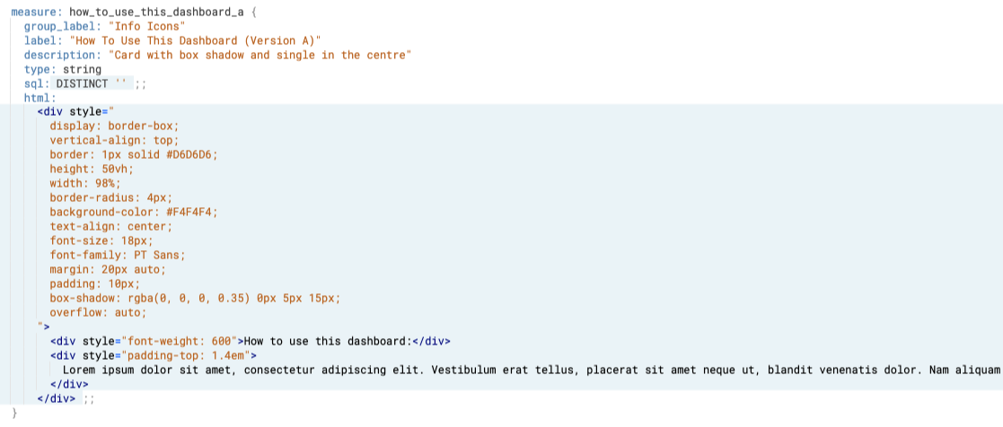
Again, this field won’t point to any specific record in your database, so you can leave it ‘empty’ (it has no value).
| Important note: Ideally, we want the field that holds this HTML ‘description’ to be an aggregating measure (e.g. of type sum) so that it returns only one single row or a measure of type string like in the screenshot above. If we don’t, we would have that ‘description’ replicated many times, as explained above. However, we have noticed that on newer versions of Looker, if the drill_field in question is a measure, the drill menu in a dashboard will display a table visualisation with the “Cell Visualisation” option enabled by default, which will take the entire space of the screen, so your information modal will not be visible. If this happens, convert your drill_field into a dimension instead of a measure, and make sure that the query only returns one single row (e.g. by using filters). |
The HTML defined above will open a drill modal with a nice minimalistic grey container, with some text inside of it, as well as some border shadow. This can be used to explain to your users how to use a dashboard, for example:

Now that we understand this core concept, the sky is (almost! See section below) the limit.
You can customise how the container appears with HTML and CSS, such as setting a border with shadow or border-radius, setting a background-color or background-image, formatting your text in different colours, fonts or paragraphs, and even adding videos or animated GIFs to give a nice finishing touch to your dashboards!
But first, let’s clear a few things out of the way.
Limitations
There are a few limitations as to the HTML and CSS content which you can use in Looker.
For example, the Looker drill menu supports neither the flexbox nor the grid layout models, which makes our task a little more complicated when it comes to positioning our elements (but not impossible!).
And unfortunately, since the only styling you can define in LookML is with inline CSS, you can’t use class selectors or ID selectors, or keywords like pseudo-elements, pseudo-classes, or even media queries.
Absolute vs. relative positioning is also not supported. This means that making our modal responsive or adding fancy animations will be quite hard (but do let me know if you found other hidden gems!).
Actually, there are many CSS and HTML tags, attributes and properties that are altogether not supported (yet?) by Looker, as described in this HTML sanitization documentation article. So, we need to work with whatever we are allowed to. Most of the functionalities that Looker does not support have been purposefully limited for security reasons, but having the ability to use external or internal CSS or modern layout models like flexbox or grid would make our lives as LookML developers much easier.
So instead of flexbox or grid, for example, we will use other techniques like tables or legacy layout models like floats.
3. Dimensions of the Container
The first thing you want to define is the space of the container to work with when you open the drill menu, both horizontally and vertically, so you know how to position your inner content (text, paragraphs, images, etc.) and the amount of content you can fit in.
Note that you can also make the element scrollable if the inner content exceeds the size of the container (e.g. using overflow: auto), but for a better user experience, we recommend sticking to the dimensions of the container available on most screen sizes (try resizing your window to see if the content fits in different configurations).
Start by making your container (which could be, for example, a div) as display: border-box and add some border to see the full space available on the page. Here’s an example:

We found that a height of 50vh worked well on both generic laptop screen sizes as well as several external monitor sizes, but you might want to tweak this metric to fit your needs. “vh” is a unit of measurement based on the viewport’s height, which means the viewer’s browser window size. If the viewer’s window height is 60cm for example, 50vh is half of that, so 30cm. With this relative measurement unit, you’ll ensure that the frame of your container is responsive and adapted to various screen sizes.
For the width of the container, instead of using vw (which is the equivalent of vh but for the viewport’s width), you can use 100% (or a little under if you use shadow; see below), which will stretch the container horizontally on all the space available:

In case you didn’t want the width of the container to take up the full space horizontally, you can set a different width and add a margin: 0 auto, as seen below:
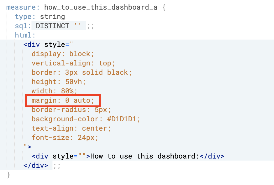
This will ensure that the container is horizontally centred regardless of the width you define, for example:

4. Adding Shadow to the Container
Unless you were in the web development team of Yahoo! Games in the 1990s, you will probably want to add some shadow and styling to your container to make it look more like a card:

You will need to add some margin and reduce your width a little, otherwise the shadow won’t display entirely. You can then use box-shadow to configure your shadow effect:

There are hundreds of possible variations of shadows, borders and background colours to use in HTML, depending on preferences, needs, specifications, company themes, etc.
A useful resource I often use for shadows, which is very simple to use, is this. And for colours (which you can add to your shadow, but also to text, borders or background), I often use this website or this one.
5. Container Style
Next, you’ll want to style your container a bit more before adding content. You can style your shadow, add a background image or colour (linear-gradient anyone?) or use different shapes.
For example, you could add some more funky shadow to your container:

Or you can make it look like a minimalist card with rounded borders like so:

6. Content of the Container
a. Overview
Now that we have our container set up, we can add as much text as we want, change how users can scroll through the content, change the formatting of our text, configure a layout that fits our needs, and even add images, GIFs, videos or sound.

Unfortunately, Looker doesn’t support pseudo-elements (like hover or active) as mentioned above, nor does it support animations, transitions or transforms, so you won’t be able to create any fancy, responsive web pages as of yet. But it’s a start!
Below are a few examples of what sort of drill overlays you can create with this method:
b. Text & Paragraphs
In addition to the examples above, you could also split your text into different columns or paragraphs which makes the content easier to digest:

c. Image and Text Side by Side
If you were to add an image into your drill overlay, you could describe some tiles on your dashboard in an easy-to-read format:

d. Text Wrapped Around an Image
Or you can leverage floats to make your paragraphs wrap around your image(s):

e. Text and Animated Images (GIF)
And yes! GIFs and videos are supported too (well done, Looker), so describing how your filters or charts work in real-time becomes easy and intuitive:

f. Text and Video
Finally, videos are also supported in LookML visualisations. This feature is highly demanded by Looker customers, who can talk through their dashboards with step-by-step instructions or add company-branded content (audio is also supported!):

To achieve this, you’ll need to host your video on the web, for example by using a Google Cloud Storage bucket (iFrames and Youtube videos are not supported). Then, use the video tag next to your text to display your embedded video like so:

You can also set the autoplay attribute on your video if you want your users to see the video playing instantly when they open the drill menu (otherwise, they will have to click on the play button).
More Examples

At Datatonic, we have developed a plethora of examples of drill overlays that you can use for all your dashboarding needs, and we can work with you to model a custom solution that matches your exact requirements. Don’t hesitate to get in touch with us so we can discuss what this would look like for you.
Once you’ve implemented this technique, I promise you’ll never go back to the old ways of building dashboards!
Do you want to create powerful dashboards for your business users or take your BI capability to the next level? Have a look at how we created a sophisticated alerting system for leading online retailer, MandM Direct, or contact us.