Machine Learning for Predictive Maintenance – Part 2: Predicting Hard Drive Failure

In the last post, I gave a brief overview of predictive maintenance. If you haven’t read it already I’d recommend going back and checking it out to get some context. In this post, I will try to take some of the ideas and recommendations from the first part and apply them to a real-world data set, Backblaze hard drive failure data. We will first do some exploratory data analysis and visualizations to get a feel for the data. We will then do data preprocessing using Google BigQuery. Once our data is relatively nice and clean, we’ll train a few simple machine learning models and compare the results to a heuristic.
The goal here is not to build a robust, production-ready model. Rather, we’d like to explore the data and quickly assess if a machine learning approach looks promising for this particular use case. One nice thing about working with a public dataset is that we can read about how others have approached the problem. Looking at all these different examples not only gives us a lot of sources of inspiration but also serves as a great reminder of the diversity of approaches possible when doing predictive maintenance. We will be doing this work with Python on the Google Cloud Platform. The code is available in a GitHub repo here. For this project, I’ve been using AI Platform and notebooks in particular. This is a managed service that is tightly integrated with other GCP products we’ll be using like BigQuery, so it’s perfect for getting up and running on a data science project. The easiest way to get started is to create a new notebook instance in AI platform, open up a terminal, and clone into the git repository.
Data
The use-case we will explore is predicting hard drive failure. The data consists of daily snapshots of the SMART statistics and a failure label for all operational hard drives in a data center since 2013. SMART stats are meant to be indicators of drive reliability and should, in theory, provide good input features to a predictive model of drive failure. Indeed, a study conducted by researchers at Google did find that certain SMART stats are highly correlated with failure. They also pointed out, however, that there was no recorded SMART error in 36% of failures. The implication is that a machine learning model will be unable to predict all failures since there will be cases where there is no “signal” of failure in the data. This doesn’t mean we should give up straight away; in most predictive maintenance scenarios there will still be failures we are unable to catch. We can’t know for sure the potential benefit of a new predictive maintenance strategy until we actually test it out and compare it to appropriate baselines or the status quo.
In the last blog post, we discussed how we are likely to encounter “big data” in predictive maintenance scenarios. How do the general challenges we discussed relate to this particular dataset? Well, we do have some volume: we have nearly 2,000 csv files (one per day) for a total of 151 million recordings (rows), corresponding to about 55 gigabytes of data.
The first step is to get all of the data into Google Cloud Storage (GCS) as csv files. After that, we ingest all the data into a partitioned and clustered table in BigQuery, which is Google Cloud’s data warehouse. Even though 55 GB might seem like a lot of data, once it’s in BigQuery it’s easy to manipulate since we can use standard SQL and the query engine is incredibly fast. We can use the preview feature in BigQuery to get an idea of what the data looks like:

We see that we have both “normalized” and “raw” columns for each of the SMART features. The “normalized” columns actually have nothing to do with statistical normalization but are instead manufacturer-specific readings indicating the health of a drive. There’s still a little way to go before we are ready to do some machine learning. Going back to the challenge of variety in the data, we have drives from several different manufacturers. Dealing with different models of machines from different manufacturers is a recurring problem in predictive maintenance. In this case, reported values for the same SMART stat can vary in meaning based on the drive manufacturer and the drive model. Since we are trying to get a prototype working as quickly as possible, we will simply focus on a single hard drive model, ST4000DM000, constituting about one-third of the entire data set. This still leaves us with about 50 million rows and 20GB of data. How to generalize beyond this single hard drive model is something we will need to address if we actually want to productionize our code, but let’s first make sure that our results are promising before we try a more sophisticated, generalizable approach.
We also have reason to doubt the veracity of the data. SMART readings can be out-of-bounds, noisy, or inaccurate, and we still have quite a bit of missing data. One step to address these problems is to filter out columns where a lot of the entries are null. Fortunately, data velocity is not a huge concern for this problem: we only get daily snapshots for each hard drive. Finally, we have reason to believe there is value in the data based on our background research, but this is what we’d like to confirm now.
We have labelled instances of failure in the data, meaning we can easily translate our predictive maintenance problem into a supervised machine learning problem. I’d like to do classification (i.e. will this drive fail or not?), but remember from the last blog post that there are a couple of problems with this approach. The first is class imbalance; we have roughly 50 million instances (or rows) in the data, but only about 3500 of these instances are labelled as failures. The second issue is that we would probably like to know ahead of time whether a hard drive is going to fail (that is the point of predictive maintenance). As a first step to address these problems we can define different “failure horizons” of N days before the labelled failure such that all instances during these days are also labelled as failures. If we define a failure horizon of a week, for example, then the 7 days before the actual failure will also be labelled failures:
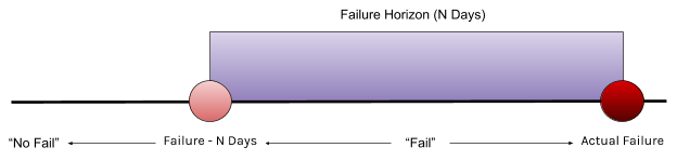
I decided to test 4 different values of “N”: 1, 2, 7, and 30 days. This essentially means that we will have 4 different classification problems, and a separate model will need to be trained for each. In practice, there may be some requirements or constraints associated with N. For example, does N=1 really leave enough time for maintenance? On the other hand, training on an excessively large N may lead to a model prone to false alarms. For now, we just test a few different values to get an idea of its effect on performance. To summarize, the initial cleaning steps consist of the following:
- Filter all of the data on the model to only include ST4000DM000
- Calculate the percentage of nulls in each column and then filter out those columns with a high percentage of missing values
- Create label columns for the four different classification problems
Visualizations
I noted in the previous blog post that, in predictive maintenance, we will likely have to deal with time-series data. First things first, let’s create some simple plots of these time series to get a better idea of what is going on.
In order to visualize the time series, I added a 30-day historical context window (i.e. 30 days leading to the day of failure) to each failure instance in the data before 2019. I also randomly sampled a roughly equal number of 30-day windows without failure meant to illustrate “normal” operating behaviour. This leaves us with about 6000 different 30-day windows; half of these windows constitute the “fail” group in the plots below (the drive fails on day 30 in the window), while the other half represent the “no fail” group in the plots below. The first thing we can look at is the average readings during each day of the windows for the “failed” and “no fail” groups. From a page on the Backblaze website we know that they use 5 SMART stats as a means of helping determine if a drive is going to fail: SMART 5, SMART 187, SMART 188, SMART 197, and SMART 198. Let’s plot the averages of these five features for each day of the window for both the “fail” and “no fail” groups:

It’s pretty clear from looking at the graphs that, on average, there exists a difference in the readings for drives that do and do not fail. It turns out that Backblaze already uses a simple predictive maintenance procedure—they investigate the drive when the RAW value for one of these five SMART stats is greater than zero. Based on the above plot this generally seems to make sense except for SMART 188 (though based on the confidence interval the data is probably skewed by a few large outliers). Let’s also inspect individual samples to see what the readings actually look like:

From looking at a few different samples, this seems to be a typical case. Readings are at zero for most of the time until right before a failure when one or more of the SMART stats will jump up. But what does this actually mean for us? Well, we could just try to look at snapshots of the SMART stats (ignoring the drive’s history) to classify if there is an impending failure. On the other hand, most of the SMART stats tracked in the data are cumulative in nature. A drive where reported uncorrectable errors (SMART 187) suddenly jumps from zero to 20 in one day is probably more likely to fail than a drive that has slowly accumulated 20 reported uncorrectable errors over the course of several years. We will keep this information in mind as we train our models next.
Training
We now have a basic setup to do some machine learning. For each of the four classification problems corresponding to different failure horizons, we will train two machine learning models. One model will only look at SMART stats at a single point in time while the other will try to incorporate some historical context in making a prediction. For the latter, we will get 10 days of history and do some aggregations on this history in order to extract more features. Specifically, we will look at the mean, variance, min, max and last value of each SMART stat over these 10-day windows. These are very simple aggregations, but we are just trying to understand whether there is a benefit to including some context when trying to predict failure. If there is, we might try some more complex aggregations down the line (see this page for some examples). There are a couple of things we still need to address:
- We still have heavy class imbalance (even if we use a failure horizon of a month we still have over a hundred times more non-failures than failures).
- We need an appropriate baseline.
In order to address the heavy class imbalance, we will do some naive downsampling of the overrepresented (non-failure) class so that we end up with a roughly 50:50 class split. This is a rather crude solution and will result in us throwing away a lot of data, but it does also come with some advantages. It’s the simplest sampling procedure and the resulting datasets will be small enough (<1 GB) that we can manipulate them in-memory using pandas. This means we’ll be able to see if the results are promising very quickly! Recall that the goal here is to demonstrate the benefits of machine learning for this use case. To do this, we need a baseline with which to compare. For a suitable baseline, why not just use the one already provided to us by BackBlaze? We predict failure if any of SMART stats 5, 187, 188, 197, or 198 are greater than zero.
We’ve finally gotten to the point where we can train a machine learning model! But which to use? As discussed in the last blog post, there’s a lot to choose from. I decided to start with XGBoost, a gradient boosting algorithm. XGBoost is a great starting point for machine learning on structured (tabular) data. It usually offers an attractive combination of great prediction performance and low processing time. Another plus is that the algorithm gracefully handles nulls: even after our preprocessing we still have a lot of missing values. For now, we will see what xgboost can do with the data as-is, but in the future, we may want to explore a more clever imputation strategy. One potential limitation is that while XGBoost might be able to perform well on a small subset of the data, it is probably not the best choice to really take advantage of the full dataset.
For each dataset (corresponding to the four different failure horizons), we create a train/eval split, train XGBoost (both with and without historical context) on the training set, and evaluate the model (as well as our baseline) on the eval set. To keep it as simple as possible, we just use the default parameters for XGBoost and do not perform any feature selection for now. Evaluating our baseline is straightforward and requires a single line of code after defining the features we want to use:
BASELINE_FEATURES = ['smart_5_raw', 'smart_187_raw',
                        'smart_188_raw', 'smart_197_raw', 'smart_198_raw']

preds_baseline = np.any(X_test[BASELINE_FEATURES].values > 0,   axis=1).astype(int)
These are the results we get when we evaluate our two XGBoost models as well as the baseline on the eval set for each of the 4 failure horizons:

XGBoost does better than our baseline model across the board! There also seems to be some benefit to including context when making predictions. This is especially true of the recall. The practical implication might be that we catch more failures ahead of time by using some historical context when making a prediction. The results are promising. Even with no hyperparameter tuning, limited feature engineering, and aggressive downsampling, we outperform our heuristic baseline. Basically, we already see benefits even with a very naive machine learning approach.
Putting the Results Into Perspective
The results are promising when we evaluate our ML models. With very simplistic preprocessing and training procedures we could outperform our baseline on various machine learning metrics. There are also quite a few avenues we can take to further improve upon our models, which is an encouraging sign that this use case could benefit from the application of machine learning. As we discussed in the previous blog post, however, there are factors to consider beyond these relatively abstract metrics when assessing whether this is a feasible use case for machine learning. Two points that we emphasized were interpretability and business impact. This is a scenario in which we could imagine that relevant stakeholders (e.g. maintenance workers) need to be able to understand and trust the model before they would use it. Furthermore, we should take steps towards quantifying the business impact of the model in order to justify the additional costs of implementing, deploying, and monitoring a real machine learning system.
Interpretability
Although this may not be a case where model interpretability is critically important or a regulatory requirement (as in e.g. medical diagnosis or predictive policing), it could still be a deciding factor in whether or not maintenance workers actually decide to use the model. Although it’s right there in the name, sometimes we forget that part of the goal of predictive maintenance is to make maintenance more predictable. An opaque model might be counter-productive. Some types of ML models, like decision trees and linear regression, are inherently interpretable. Boosted trees have higher prediction performance than their decision tree building blocks, but are also more difficult to interpret. Nevertheless, there are some steps we can take towards better understanding the model. With XGBoost comes a built-in way to plot global feature importances. Here is one such plot of the 15 most important features for the XGBoost model trained on a 2-day failure horizon without historical context:

We won’t go into detail about what the F score is here, but simply put it is the number of times a feature appears in a tree and is therefore about as basic a feature importance metric as we can get. Many of the features seem to make sense, and we see that some of the most important features are the 5 features used in our baseline model. This seems promising, but look at the 3rd most important feature: `Smart 9 Raw` is the number of power-on hours. Though it makes sense that this particular feature is correlated with failure, it doesn’t necessarily tell us anything about the true state of the drive’s health. Does it really make sense that our machine learning model is placing such a high importance on this particular feature when making predictions?
Inspecting global feature importances like this might help us to develop an intuition about our model. We could also try to explore the local interpretability of the model by trying to understand how individual predictions were made. Exploring individual predictions might also help to isolate the source of a problem for an unhealthy drive. An example of how to implement this method is provided in the `Model_Interpretability.ipynb` notebook in the repository. Trying to better understand the model might not only increase buy-in from maintenance staff but could also help us to engineer and select features, thereby improving our model.
Impact
In order to properly evaluate our model(s), we should evaluate them on an unseen test set. I’ve left the data from 2019 completely untouched to use for testing. But instead of getting more machine learning metrics which may or may not be indicative of the model’s true goal, why don’t we try to actually quantify the impact of our model in terms of relevant business metrics? In order to do this, I’ll define a simple testing procedure. I assume that we run our ML model once a day and that a “maintenance action” is performed on a drive (meaning it is removed from operation) as soon as the model predicts that it will fail. Recall from the last blog post that there are really two things we are worried about: unnecessary maintenance and unexpected breaks. Therefore, the question we will attempt to answer is, “if this model had been used during the first half of 2019 how many unexpected breaks would there have been and how much unnecessary maintenance would we have performed?”
This leads us to the following pseudocode for our testing procedure:
unexpected_breaks = 0
false_alarms = 0

For each day:
    For each operational drive not yet removed:
        Predict whether drive will fail

        if predict failure:
            if label is not failure (False Positive):
                false_alarm += 1
            Remove drive from set of operational drives

        else:
            if label is failure (False Negative):
                unexpected_breaks += 1
                Remove drive from set of operational drives
If we run this testing procedure for the XGBoost models and the baseline model we get the following results (note there were 165 failures during this period):

No matter what model we choose, we’re going to have some unexpected breaks and a lot of false alarms. How does this compare to a simpler maintenance strategy like run to failure (R2F)? With this strategy, we would not catch any failures ahead of time (165 unexpected breaks), but we would also have zero false alarms! How do we navigate these tradeoffs to find an optimal maintenance strategy? This is the point at which a data scientist needs to be able to communicate these results with other stakeholders and to discuss business implications of the analysis (e.g. how expensive are false alarms relative to unexpected breaks?) in order to determine whether ML-driven predictive maintenance is viable or not. All of the XGBoost models have fewer unexpected breaks than the baseline model. Incorporating some history allowed us to catch a few more failures, but also led to a drastic increase in the number of false alarms. Is catching a couple more failures really worth the thousands of extra false alarms we would get? If we look at the total number of false alarms during the test, it would seem that our XGBoost models trained without historical context on a relatively short failure horizon (N <= 7) can reduce the number of false alarms relative to the baseline. As it turns out, there are many drives which have some SMART error at the beginning of the test, causing a false alarm on the first day. If we ignore these initial false alarms, the baseline model actually gave the fewest false alarms during the duration of the test! Though this testing procedure was simplistic, it can still give us a better idea of how the models would have actually performed in practice. I don’t know about you, but these were certainly not the results I was expecting based on the evaluation metrics presented above! This is a good example of why we can’t always just use simple machine learning metrics on an evaluation set to gauge how a model would perform in practice.
Conclusion and Next Steps
We covered a lot of ground in exploring this use case. That being said, the real work is really just beginning, assuming the use case is viable from a business perspective. There are some clear avenues for further exploration. We’ve already mentioned some of the things we could do on the modelling side:
- Try to generalize to other hard drive models
- Use all of the data or a more clever downsampling scheme. Some Datatonites have recently done great work on sampling schemes.
- Run hyperparameter tuning rather than just using the default settings for XGBoost
We could also do so more exploration into alternative feature engineering methods. Though preliminary evaluations led us to believe that incorporating historical context would lead to better results, our testing procedure seems to indicate that we’d actually get pretty bad performance in practice, due to an increase in false alarms. Perhaps there are other aggregations or processing steps we could try over this historical context window that could allow us to both catch more failures and have fewer false alarms?
As we can see, there are plenty of small and large tweaks we can try in order to boost the performance of our model. In general, it seems as though it may be difficult to further reduce the number of unexpected breaks and where we’ll really see a benefit is in bringing down the number of false alarms. In order to make a real impact for the business, though, we’ll have to turn our ML model into a deployed solution. Indeed, we’d like the output of our model to guide relevant individuals in making the best decision on when and where to focus their time when performing maintenance. The form of this solution could be anything from email alerts to near real-time visualization dashboards. This leads to another set of challenges as we focus on the human impact of our models, which we already started to explore a little bit when investigating model interpretability.
As you can see, using machine learning for predictive maintenance is no easy task. We even had a lot of relatively high-quality data with labelled failures, which is definitely not always the case! As it stands right now, it is not clear that this use case would benefit from a machine learning model instead of the existing baseline. In the next part of this series, we will explore some of the ways in which we could improve our model.
Do you have questions or projects you’d like our help with? Get in touch – we’d love to hear from you.


