TfL Hackathon: Datatonic’s Traffic Optimisation Solution

A few weeks ago Datatonic took part in a hackathon organized by TfL. In case you were wondering, TfL is not some odd shorthand for Tensorflow; it is Transport for London we are talking about in this blogpost. After all, we (Datatonic UK team) while busy unleashing the power of big data, do live and move around the (very congested) physical space of London!
Datatonic was present at the Transport for London Hackathon kick-off and is ready for the traffic optimisation challenge! #tfl #hackathon pic.twitter.com/CIxhnWwFxS
— datatonic (@teamdatatonic) September 23, 2016
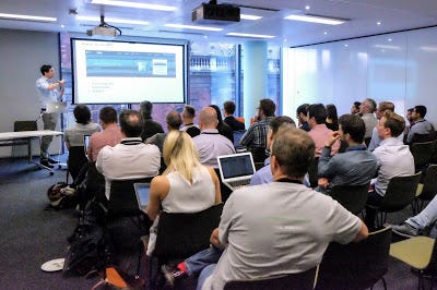 Transport for London Hackweek: kick-off session
Thus, upon seeing the rich (read 5TB) traffic sensor data produced by TfL’s Urban Traffic Control (UTC) system, we immediately asked ourselves
- Can we visualise these data, in real time and in an interactive manner?
- Can we predict traffic congestion in advance?
Before jumping into how we achieved these two goals, let’s take a look at the data we have at hand.
1. Data — 120 billion IoT Events
In this UTC dataset, London is divided into 5 zones (NORTH, SOUTH, CENTER, OUTER and EAST). All the files were stored as zipped CSVs on Google Cloud Storage (GCS), a total of about 5TB, every file containing 5 minutes of data per zone. Every line in the file contained a timestamp (measurements are taken every quarter of a second), a certain amount of sensors (up to 8) specified with a sensor ID , a bitstring etc.
The part we are interested in, is the bitstring. This represents the presence or absence of a car; for example: for timestamp 26–10–2016 16:38:02 and bitstring “0010” this would mean a car was present on top of the sensor at 16:38:02.500 today and no car was present on top of the sensor for the timestamps 16:38:02.000, 16:38:02.250 and 16:38:02.750.
2. Architecture
When we hear “5TB of data” and “processing, analysing and transforming data” in one sentence, we immediately think Apache Beam (running as “Google Dataflow”). So we quickly drafted the architecture on the drawing board. You can see the implementation result of the pipeline below:

Processing 120 billion rows using Google Dataflow
The pipeline includes a look-up to a file containing the coordinates of each sensor, some windowing (to get an aggregated view over 5 minutes) and some grouping and combining by sensorID. Without going into too much detail here, the take-away is that Dataflow makes writing processing logic a lot easier and can scale with a click of the button.
We ran the pipeline using 150 virtual machines running on Google Cloud simultaneously. Therefore, the time you see in the flowchat is merely the combined computation time of all the machines running the code and processing the data. The “ReadFromStorage” step for example did not last 1 day 2 hr 33 min in real life but about 10 minutes — hashtag hackathon!
While getting the resulting data written to BigQuery overnight, we came up with the architecture for our entire game plan:

Screen Shot 2018 07 02 At 13.52.19
Reading the files from GCS (and in the future maybe from Google PubSub, when TfL provides the data as a streaming service), processing with Dataflow, writing to BigQuery for Tableau analysis and Tensorflow predictions, and to PubSub for live visualisation and predictions).
3. Live Visualisation
For live visualisation we used Processing, an open-source java-based programming language for highly customizable visualisation. The demo video is at the top of the post but here’s a screenshot:

Screenshot of the solution
The box on the left contains the selected sensor, its location, current timestamp, a few traffic engineering measures — flow, occupancy, and average speed estimation (see reference here and here), and the raw data: a box turns white when a car passes the sensor and remains blue otherwise. When consecutive sensor cells got lightened, voila, that is some traffic detected! The sensor plotted on the map in the background also brightens up correspondingly to allow an overview of how the entire London road network is faring. As captured in the screenshot in the instance of a Friday afternoon, the central London in view is only congested at a few scattered intersections but generally without much traffic!
4. Predict Road Congestion with Tensorflow
As for the real-time analysis we used Dataflow to convert the raw bitstream from the sensors into two commonly used measures in traffic engineering: occupancy and flow. Occupancy simply tells us how often a sensor detects a car. It can be further divided by the average car length (around 4.5 m) to obtain the traffic density of a sensor. Flow on the other hand is a measure of the number of cars passing over a detector in a given time. Combining these two measures allows us to calculate the average speed per car (as flow/density), which we will use later to determine congestion.
(a) Visualise traffic:
Before we attempt to model the congestion in London, we will first visualise some of the sensor data. This will give us an overview of the key measures and it will also help us to define and quantify congestion. Tableau is a great choice for this task since it offers convenient and great looking map views.

Congestion Measures
The figure above shows some of the traffic indicators plotted against each other. You can also track the time behaviour by looking at the colours. Overall, the figures agree nicely with the theoretical behaviour found here. We see for example that the speed decreases as the density increases (more cars on the road -> slower traffic).
(b) Define congestion:
To find out if a road is congested or not we need a single, robust quantity that describes the traffic state on that road. Finding such a measure is far from simple as we can illustrate by looking at flow: Flow is small for small values of density, but also for large values of density. This means zero flow can either mean a free road with no traffic or total congestions. To resolve this ambiguity we settled for speed as our congestions measure after some testing. In more detail we use speed/max(speed) as a congestion measure, since the absolute speed can vary largely between roads. Here, the max(speed) value is the maximum speed of a road, which will be usually achieved if there is very little traffic.
A relative speed value of 0 then means complete congestion and a value of 1 means the road is free. We plotted this congestion measure for small group of sensors in the map view of the above figure (top left). Such a congestion measure based on relative speed has been previously used by traffic engineers. However, it is worth noting that there is no ideal measure of congestion and many different definitions can be found in the literature.
© predict traffic with LSTM network
Now that we have a good measure for congestion we can try and predict its value using historic data. For this we build a deep learning model which uses the past 40 minutes of traffic data (relative speed) as input and which will then predict the congestion measure 40 minutes from now.
For the model we selected a LSTM recurrent neural network (RNN) which performs exceptionally well on time series data. We won’t go into detail here about how the neural network works and how it is setup up, but you find a great article explaining LSTM networks here. Our implementation of the model was done in TensorFlow which has built in functions for RNNs and the LSTM network. To simplify the problem we selected a small group of around 300 sensors out of the 12’000 sensors in London (the group can be seen in the map view above).

Schema
We trained the model on a small set of only 8 days of traffic, but the results are already promising. The model can forecast the traffic 40 minutes into the future with good accuracy and it predicts the morning and afternoon rush hours nicely. The image below shows the predicted vs. actual speed for a few different sensors.

Comparison between predicted (orange) and actual (blue) relative speeds of a set of sensors throughout a day
You can see how the neural network captures the different daily behaviour of each sensor individually. However, looking closely at the above graph you will find that some of the details of the time series data are not well reproduced. We also found that there are a few sensors that show a large overall prediction error. In order to increase the accuracy of the LSTM network it could be trained on much more data than just 8 days. Further, including more sensors might help training and of course all the sensors needed for a congestion prediction system for the whole of Greater London. Still, the model we have developed has a lot of potential and might help to do the following after some more tuning:
+ predict future traffic state
+ predict congested areas so they can be avoided or reduced
+ detect incidents quickly
5. Final Thoughts
Apart from producing cool maps and insightful forecast, we hope our efforts have served these two purposes beyond this particular project:
Technically, we demonstrate that Google DataFlow is capable of easy and fast scaling-up, which powered our real-time visualisation of a 5TB dataset. Additionally, Apache Beam SDK is shown to be future proof — the code can be re-used completely, with very few changes, to process data from a real-time live stream instead of batch file input (one of the key benefits of Apache Beam). Also, we show that deep learning model implemented within framework of TensorFlow is able to predict time series event based on trend in a short proceeding period of time — quite accurately considering the scarce amount of training data we have got!
In a broader context, it is our attempt to explore utilising urban-scale sensor data, which is inevitably becoming all the more prevalent. We, as machine learning and big data experts here at Datatonic, are keen on turning these IoT data into valuable, actionable insights for businesses, policy makers, and citizens like us ourselves.